Data Visualization: Communicating Complex Information Effectively
Data visualization plays a crucial role in communicating complex information in a clear and digestible manner. When effectively designed, visual representations of data enhance insight generation, facilitate decision-making, and persuade audiences to take action. The effectiveness of data visualization relies not only on the accuracy of the data but also on the strategic communication techniques employed in the design process (Kazakoff, 2022). This post examines three key data visualization communication strategies that improve audience engagement and understanding: audience-centered design, persuasive storytelling, and effective graph selection.
The Importance of Audience-Centered Design
A core component of effective data visualization is understanding the audience’s needs and preferences. The audience’s familiarity with the topic, their visual literacy, and their cognitive limitations influence how they interpret visual information. According to Kelly and Tovey (2022), tailoring data visualizations to the audience's level of expertise increases comprehension and engagement. A general audience benefits from straightforward visuals such as bar charts or pie graphs, whereas a more technical audience may appreciate complex data visualizations like multi-dimensional scatterplots.
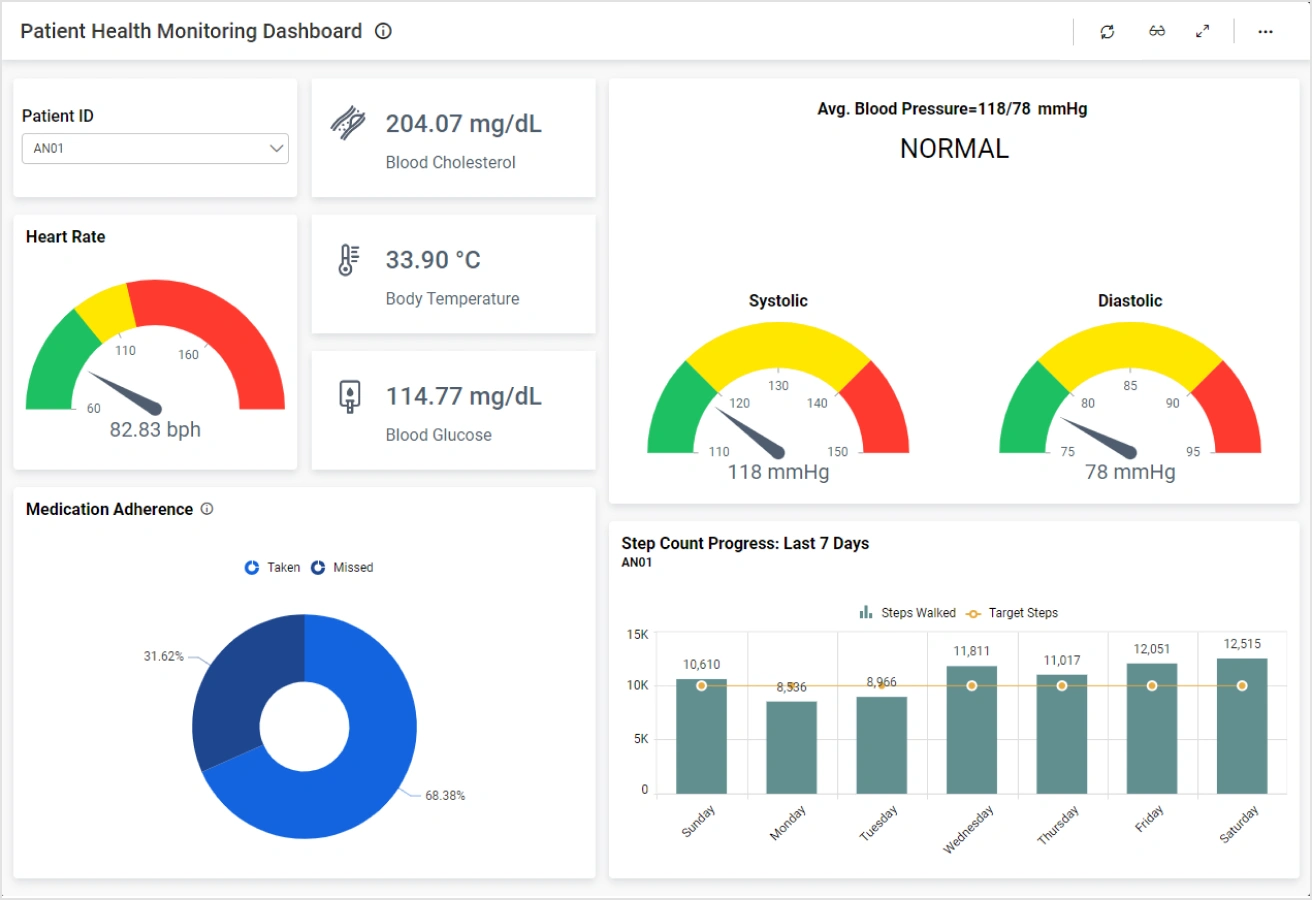
Furthermore, consideration of potential biases and perceptions is essential in crafting a neutral and effective visualization. Research by Garreton et al. (2023) suggests that the inclusion of culturally relevant graphics and familiar visual elements enhances audience engagement and interpretation. An example of audience-centered design can be seen in the use of dashboard analytics in healthcare. Hospitals use dashboards with color-coded indicators to monitor patient data efficiently. By leveraging simple, universally understood color schemes (such as red for danger and green for safety), these dashboards improve real-time decision-making and patient outcomes.

Persuasive Storytelling in Data Visualization
Beyond simply presenting data, persuasive storytelling integrates narrative elements into visual communication, making data more compelling and impactful. Research shows that well-structured visual storytelling enhances retention and emotional connection to the data (Pandey et al., 2014). The persuasive power of data visualization relies on the ability to frame data within a meaningful context that resonates with the audience. This approach is particularly effective in marketing, policymaking, and business intelligence, where the goal is to influence decision-making.
The storytelling approach is also evident in public health communication, particularly in response to the COVID-19 pandemic. Jensen et al. (2023) highlight that effective COVID-19 data visualizations played a crucial role in informing the public, shaping policy decisions, and guiding health interventions. During the pandemic, visual representations such as interactive dashboards, heat maps, and time-series graphs helped convey real-time data on infection rates, hospitalizations, and vaccination progress.
The Role of Effective Graph Selection
Choosing the appropriate graph type is fundamental to effective data visualization. Different visual representations are suited to different types of data and analytical purposes. Zhu and Ni (2021) emphasize that the wrong choice of visualization can mislead audiences and reduce trust in the presented information. For example, a bar chart is ideal for comparing categorical data, whereas a line graph is better suited for illustrating trends over time.
The selection of visualization tools should also account for data complexity. In some cases, advanced visualization techniques such as heat maps, tree maps, or network graphs are necessary to convey multi-dimensional relationships. Figure 3 illustrates the effectiveness of using a heat map to visualize customer engagement across different time intervals.
Kazakoff (2022) highlights that avoiding overcomplication is critical. While advanced graphics can be visually appealing, they may overwhelm the audience if they require extensive interpretation. The principle of simplicity suggests that visualizations should prioritize clarity, focusing on key insights rather than excessive detail.
Application of Data Visualization Strategies Across Industries
Effective data visualization strategies are widely applicable across various industries, including business, healthcare, education, and government. Each industry benefits from tailored approaches to data communication:
• Healthcare: Hospitals use audience-centered dashboards to monitor patient outcomes and optimize resource allocation.
• Marketing: Businesses apply targeted visualizations to interpret consumer behavior and enhance campaign strategies.
• Public Policy: Governments leverage clear and persuasive graphics to educate citizens about policy changes and social initiatives.
Conclusion
Data visualization is not just a tool for presenting information; it is a strategic communication method that influences understanding, decision-making, and persuasion. By employing audience-centered design, integrating persuasive storytelling, and selecting effective visual representations, data professionals can enhance the impact of their visualizations. These strategies ensure that data is not only presented but also understood and acted upon. As data visualization continues to evolve, professionals must refine their communication techniques to maximize engagement and effectiveness.
References
Garreton, M., Morini, F., Celhay, P., Dork, M., & Parra, D. (2023). Attitudinal effects of data visualizations and illustrations in data stories. IEEE Transactions on Visualization and Computer Graphics, PP, 1–16. https://doi.org/10.1109/TVCG.2023.3248319
Jensen, E. A., Borkiewicz, K., Naiman, J. P., Levy, S., & Carpenter, J. (2023). Evidence-based methods of communicating science to the public through data visualization. Sustainability (Basel, Switzerland), 15(8), 6845. https://doi.org/10.3390/su15086845
Kazakoff, M. (2022). Persuading with data: A guide to designing, delivering, and defending your data. MIT Press.
Kelly, S., & Tovey, T. L. S. (2022). Data visualization as communication: The role of business communication in data analytics. Business Communication Research and Practice, 5(1), 42–45. https://doi.org/10.22682/bcrp.2022.5.1.42
Pandey, A. V., Manivannan, A., Nov, O., Satterthwaite, M., & Bertini, E. (2014). The persuasive power of data visualization. IEEE Transactions on Visualization and Computer Graphics, 20(12), 2211–2220. https://doi.org/10.1109/TVCG.2014.2346419
Zhu, W., & Ni, T. (2021). A study of big-data-driven data visualization and visual communication design patterns. Scientific Programming, 2021, 1–11. https://doi.org/10.1155/2021/6704937